87% of Presentations are Dysfunctional

87% of presentations are dysfunctional – they do not work - they do not engage the audience and cost not only time and money but also energy, undermine your credibility and have a significant negative impact on your brand.
Last week an executive told me that she and her team experienced "death by PowerPoint" having to sit through 198 slides just like this example where the “so-called presenter” just read the text. This is what I call Karaoke presenting, its not only very ineffective it's a form of audience abuse and should be a criminal offense.
So rather than using slides as a cue card and just reading the text…
The 1st “golden rule” is the slide should not make sense on its own.
If your presentation taken in the aggregate (e.g., your “PowerPoint deck”) can be perfectly and completely understood without your narration, then it begs the question: why are you there? Save people’s time and energy and just email it to them, they can read.
So, is it finally time to ditch PowerPoint? Hardly, but it is long past time to ditch the use of the ubiquitous bulleted-list templates found in both PowerPoint and Keynote. And it’s long past time that we realised that putting the same information on a slide that is coming out of our mouths usually does not help — in fact usually hurts our message. PowerPoint is just a tool, which means it’s only as good as its users. Typically, the presenter shows the content on their slide, and then repeats the same information verbally. But as the audience can read 7 times faster than presenter can read the words on the slide, the presenter becomes unnecessary, and the audience gets bored and disengages how much information will be remembered, less than 10% 24 hours later? FACT!
The 2nd “golden rule” is the role of the presenter is to tell the story to resolve the inconsistency with the visual on the slide.
Used well, PowerPoint can be an enormously valuable tool, one that can help you communicate more effectively. The right visuals, displayed in the right way, can make your communication stickier and key points more memorable. They can make your audiences feel deep emotion and drive people to action.
"It is effective to speak to a diagram, because it presents information in a different form. But it is not effective to speak the same words that are written, because it is putting too much load on the mind and decreases your ability to understand what is being presented. Professor John Sweller (UNSW)
Here Sweller is referring to both the redundancy and modality effects: How to increase audience engagement content that is well designed, that uses visuals and animation in an intelligent way, is going to draw in and engage audience members. It compels them to pay attention and helps them to understand and remember what even the least charismatic presenter amongst your team has to say.
The 3rd “golden rule” is look at the audience and not the screen behind you.
Eye contact where you sweep slowly across the room, drawing in as many people are you can, helps engage the audience. Have a dual monitor in front of you, or on the speaker’s lectern near you is a reasonable alternative. What you have to avoid is people looking at the back of your head while you check, or worse – read the screen.
Coaching really helps; our tools and methods have been Tried, Tested and Proven, both in the Academic world and in the hard world of sales. A recent testimonial given by a SVP of a major global company stating their pitch conversion rate went from 17% to over 68% by applying all the tools and techniques.
If you want to achieve similar results – email me here
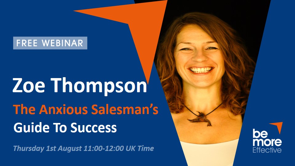
For more information please send a message via the Contact Us Page. Or you can register for an upcoming webinar.


